Is your raise actually keeping up with prices in 2026? What the wage data says
Job Search · ResumeVera Editorial · October 5, 2026 · 9 min read

Ask someone whether their last raise actually got them ahead of prices, and you get a hedge almost every time. It feels like more money and it also feels like it buys less. Both halves of that feeling are backed by real federal data right now, which is part of why the question is genuinely hard to answer with a single number. We pulled the three main data sources that speak to it directly, and they tell slightly different stories depending on what exactly you ask.
Three numbers, three different stories
Start with the plainest version of the question: is pay per hour, adjusted for prices, higher or lower than a year ago. The Bureau of Labor Statistics answers this every month in its Real Earnings report. For August 2026, released September 11, 2026, real average hourly earnings for all employees were $11.30, down 0.1 percent from July and down 0.3 percent from a year earlier. Nominal, not-inflation-adjusted average hourly earnings were $37.75, up 0.3 percent for the month. The gap between those two monthly figures, a 0.3 percent nominal rise against a 0.4 percent rise in the Consumer Price Index over the same month, is the entire story: pay went up, prices went up faster, and the real number slipped. Real average weekly earnings told a slightly better story over the year, up 0.3 percent, because people worked marginally more hours, not because pay per hour improved.
Now widen the lens to the Employment Cost Index, a quarterly measure the BLS considers the most reliable gauge of underlying compensation trends precisely because it tracks a fixed set of jobs rather than whoever happens to be employed that month. For the 12 months ending June 2026, wages and salaries for civilian workers rose 3.2 percent, not seasonally adjusted. Private industry workers saw a nearly identical 3.1 percent. That figure sits meaningfully above the real earnings report's implied pace, and the reason is methodological, not a contradiction: more on that below.
Then there is the Federal Reserve Bank of Atlanta's Wage Growth Tracker, which answers a third, more personal question: how much did your own wage change, if you are the same person the survey is following month to month. Its August 2026 reading split sharply by one factor, whether you changed jobs. People who stayed in their job saw median wage growth of 3.6 percent, the three-month moving average. People who switched jobs saw 5.0 percent, up from 4.4 percent in July.
Why three good surveys do not agree with each other
None of these three numbers is wrong. They are measuring different things, and the difference matters more than any one of them on its own.
The Real Earnings report comes from the Current Employment Statistics survey, which asks employers how much they paid, in aggregate, across all their current employees that month. If a company replaces several mid-career workers with entry-level hires at a lower rate, this survey can show average pay falling even though every individual worker's own pay rose, simply because the mix of who is being paid changed. It is a snapshot of the whole payroll, not a measure of what happens to any one worker's paycheck.
The Employment Cost Index exists partly to correct for that. It holds a fixed sample of jobs constant across quarters, specifically so that employers hiring more lower-paid workers, or fewer, does not move the number by itself. That is why economists and the Federal Reserve lean on the ECI more heavily when judging whether wage pressure is really building or easing, and it is also why it can read noticeably higher or lower than the simpler average hourly earnings figure in the same period.
The Atlanta Fed's tracker solves a different problem again. It follows the same individuals over time using Current Population Survey panel data, so it can answer a question neither of the other two can: not what happened to the average paycheck, and not what happened to a fixed basket of jobs, but what happened to your pay specifically, conditional on whether you changed employers. That is the only one of the three built to isolate the effect of switching jobs at all.
The number that actually separates winners from everyone else
Line the Atlanta Fed figures up against inflation and the gap is not subtle. The Consumer Price Index rose 3.4 percent over the 12 months ending August 2026. Job switchers, at 5.0 percent wage growth, cleared that by a full 1.6 percentage points, a real, not just nominal, raise. Job stayers, at 3.6 percent, cleared headline inflation by only 0.2 points, close enough to call it treading water. Measured against core inflation instead, which excludes food and energy and rose 2.4 percent over the same period, stayers look noticeably better off, up 1.2 points in real terms, and switchers better still, up 2.6 points. Which inflation figure is the fairer comparison is a genuine, unsettled argument among economists: headline CPI reflects what you actually pay at the register, core CPI better isolates the underlying trend. Both are worth knowing, because they tell you how thin or comfortable your real raise actually was depending on which one you use.
Either way you slice it, the person who changed employers is coming out ahead of the person who did not, by a consistent 1.4 percentage points, the gap between 5.0 percent and 3.6 percent. That gap has shown up in this same survey for years, and this month it widened, since the switcher figure climbed from 4.4 percent in July while the stayer figure held flat.
A worked example
Say you are a business analyst earning $72,000 and your employer offers the typical stayer raise, 3.6 percent. That brings you to $74,592, an extra $2,592 for the year. A comparable role at a 5.0 percent market-rate increase would put the same starting salary at $75,600, an extra $3,600, a difference of just over $1,000 in year one alone. That gap does not reset the following year either. Next year's raise, whatever it is, gets calculated on top of whichever of those two higher numbers you are now earning, so a single switcher-level jump compounds for as long as you stay in the new role. Before treating $72,000 as a reasonable anchor either way, it is worth checking what the government's own wage data says a business analyst in your area actually earns; the BLS wage percentile breakdown for business analysts breaks it down by percentile and by the 50 largest metros, sourced to the same May 2025 OEWS release behind most of the pay data on this site.
What this means for your next move
None of this is an argument that everyone should quit their job immediately. Switching carries its own costs and risks that a wage growth tracker cannot capture: ramp-up time, lost tenure-based benefits, and the simple reality that a new role is not guaranteed to work out. What the data does support is a more specific, calmer claim: if you are the median stayer in 2026, your raise is close to just offsetting headline inflation and modestly ahead of core inflation, not a meaningful step forward either way. If you are willing to change employers, the market is currently paying close to a full extra percentage point and a half above where staying put lands you, and that premium has been widening, not narrowing, over the past couple of months.
If a move is on the table, the useful next step is seeing which open roles would actually be worth switching into, rather than guessing from a single number. A job matcher that lines your actual background up against real postings is a faster way to find out whether that 5 percent figure is realistic for you specifically than applying broadly and hoping the number works out.
Sources
- U.S. Bureau of Labor Statistics, Real Earnings, August 2026, released September 11, 2026. bls.gov
- U.S. Bureau of Labor Statistics, Consumer Price Index, August 2026, released September 11, 2026. bls.gov
- U.S. Bureau of Labor Statistics, Employment Cost Index, June 2026 (second quarter 2026), released July 31, 2026. bls.gov
- Federal Reserve Bank of Atlanta, Wage Growth Tracker, August 2026 update. atlantafed.org
These figures are revised and updated monthly or quarterly as new data arrives. We will revisit this piece when the September 2026 releases change the picture.
Questions
Frequently asked questions
Get free ATS tips every week
Actionable resume and ATS tips, when we publish them. No spam. Unsubscribe any time.
Related Articles

How long does it actually take to find a job in 2026? What the federal data says
The median unemployed job seeker in 2026 has been searching for about eleven weeks. The average is more than double that, and the gap between the two numbers is the whole story. We checked the federal data on how long searches actually run, how that compares with past downturns, and what it means for planning your own.
Read More

Why free resume builders charge you to download, and what to check before you pay
You build a resume on a site advertised as free, then hit a paywall at the download button. That pattern has a name, a body of law behind it, and a live federal antitrust case. Here is how the billing model works and what to check before you enter a card.
Read More
Do cover letters still matter? What the surveys actually say
One survey says 83 percent of hiring managers read cover letters. Another says 51.7 percent of recruiters never do. Both are real. We looked at why the numbers disagree so violently, and the reason turns out to be the answer to the question.
Read More
Try it
Check this against your own resume
The post above is general. Your file is not. The checker reads it the way a parser would and tells you which of these points it actually breaks.
Check your resume free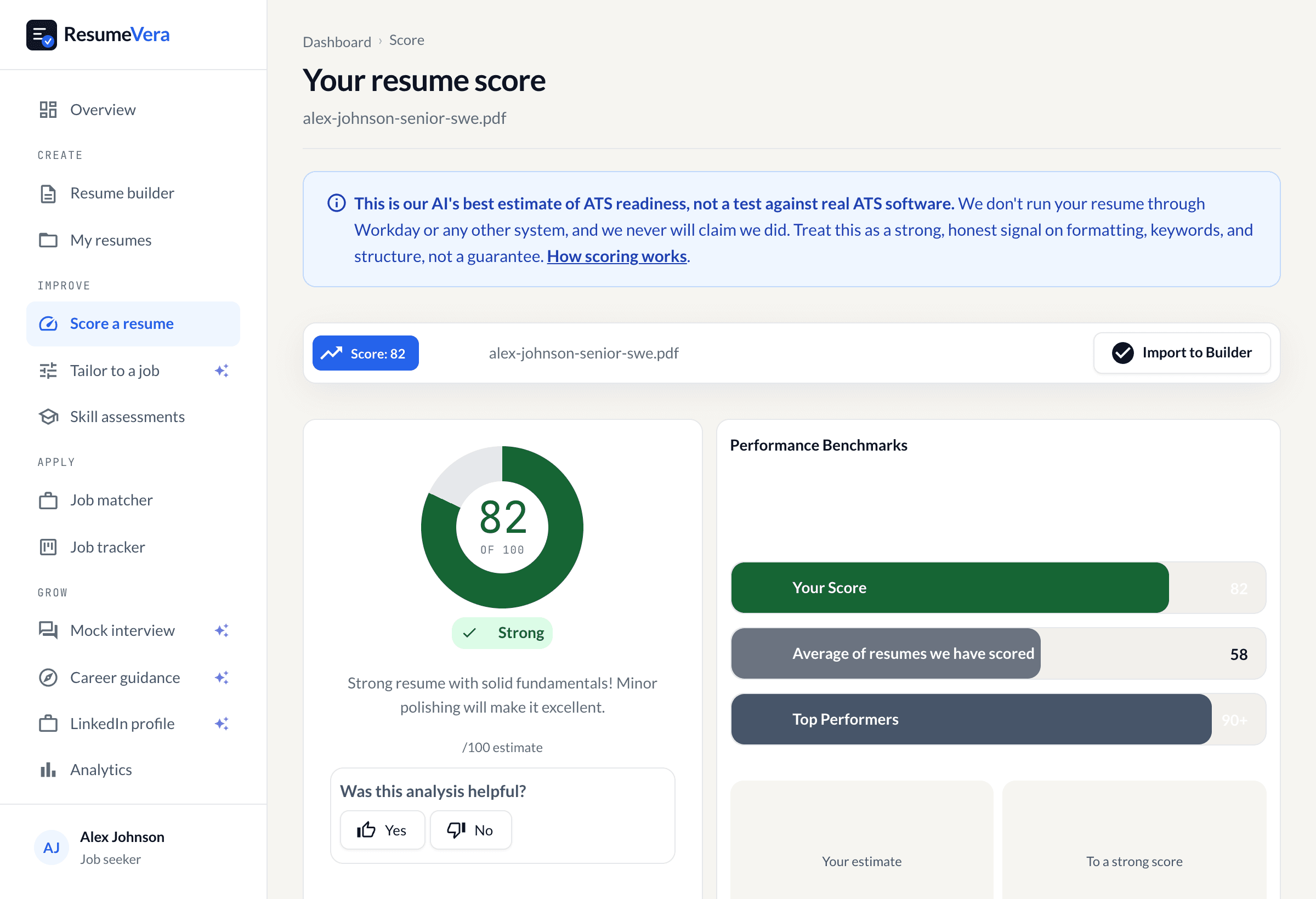
The real score page, with a sample resume and sample scores.
Now check it against your own resume
An honest resume score in seconds. No account, no card.